Intermediate Stamper
Let's LEVEL UP!
You've been stamping a while now...
You've been doing this hand stamping gig for a while now, and there may not be much NEW STUFF I can tell you to level up your game. You know by now that this is going to take more practice and more time than you anticipated if you want to get to the next level. So how do we help level up your game so you can feel confident and like the amazing stamping boss you are in your heart?
You may already be doing these three STAMPING PRO TIPS, and if you ARE, then you are AHEAD OF THE GAME! Give yourself a HUGELY big pat on the back and score one for the home team for already knowing these tips, and instead, just get some more time at your stamping block and practice, practice, practice. Click the links of the themes below to be taken to that place on this page!
USE TAPE
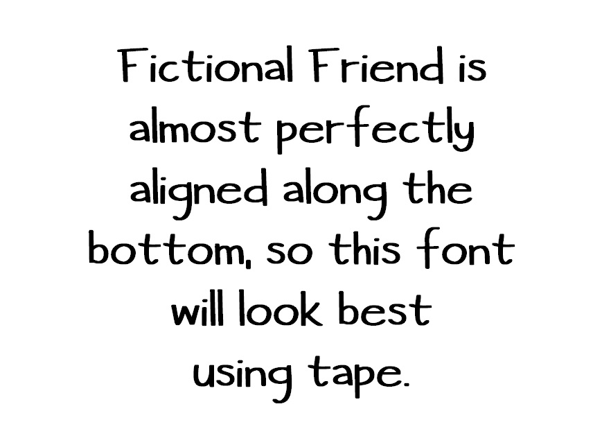
You may not have noticed, but each font on our website has some super keen details in the Product Description! For example, one tip is when I advise "THIS FONT LOOKS BEST WHEN YOU USE TAPE". If that's the case, and you aren't using tape, you're missing out on leveling up your stamping!
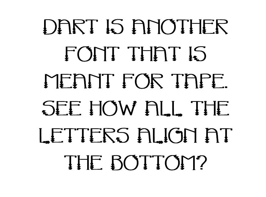
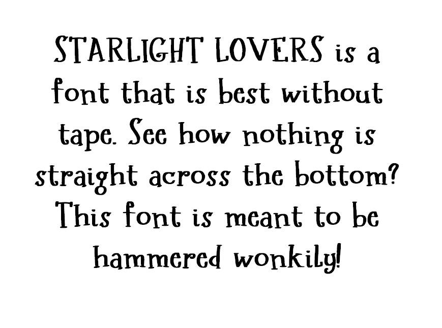
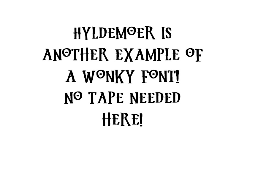
Certain fonts are designed to be typed straight across, like this font you're reading here, Shadows Into Light. Notice how it's not all wonky, the letters are all aligned, and it's super legible? That was by Foundry (font maker) design. See how all the letters I'm typing look like I have a straight line of tape under each word, aligning each letter perfectly? This is your key to look for this in the font to know whether you should be using tape or not. I promise, if you use stamping tape on fonts that are meant to be aligned with tape, the look of your stamping will level up like crazy! Check this out:
MATH YOUR SPACE
Ask anyone, I have a super difficult time mathing. When forced to math I use my trusty Alexa and ask, "Alexa, what is 1/2" in millimeters?" BUT WHY is this mathing so important? Because if you aren't doing this, then you have another opportunity to level up your stamping skills!
STAMPING PRO TIP: Learn to math the size of font and design you need based on spacing on the blank you want to use.
Say what? I know, it sounds like a foreign language, but let's play the imagination game -- where I ask you to think outside your box, and put on your "logical thinking cap" and play a game with me. Ready? Logical Thinking Cap in place? Let's begin!
Let's say I have a circular blank that's 1/4".
Mathing (or Alexa) tells me that is 6mm.
So at it's widest point, I have 6mm of space.
Now, let's do some like comparisons:
DESIGNS: these are the pretty picture/images that are one stamp of a THING -- not a font -- that you hammer into the metal to show a scene. For example, a heart, or a star. Every company will sell you metal stamps that are designs in a dozen sizes and shapes. Your goal is to think of the space you have, and how that determines the size design you need.
If I have 6mm, I can hammer ONE 5.5mm design and still have a little room for a hole at the top.
If I have 6mm, I can hammer TWO 2mm designs up/down, or vertically, from one another, with a little space between the designs, and a space for a hole at the top.
If I have 6mm, I can hammer ONE LETTER in a 5.5mm size font and still have a little space for a hole at the top.
If I have 6mm, I can hammer TWO ROWS in a 2mm font, with a a little space between the rows, and still have room at the top for a hole.
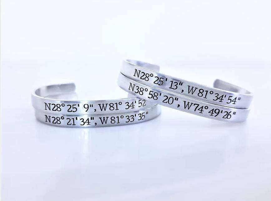
Let's look at the photo of the cuffs. Each of these cuffs are 1/4" wide. That means I have 6mm to hammer from the top of the cuff to the bottom of the cuff. I selected a font that was 4mm tall. That way, I had 1mm on top and 1mm on bottom and that made spacing on the middle of the blank super easy. To center your text on the blank, use a ruler to find the center of the blank, THEN, find the middle letter of your words when written on a piece of paper, and you'll be able to start hammering FROM THE CENTER OF THE BLANK to the left, and then to the right. This will ensure you're as close to the middle as possible. (Caveat: the number 1 and the letter i (uppercase and lowercase) are very narrow compared to an M or a w or an 8, so they will kind of mess with your centering. Keep that in mind... cheat one way or another a beat to compensate for wide and narrow letters and numbers!)
Are you starting to "see" where I'm headed with this? When you learn to BREAK DOWN THE BLANK INTO MILLIMETERS, you can start to envision what will fit on your blank. Try it with a 1/2"! What can you fit now?
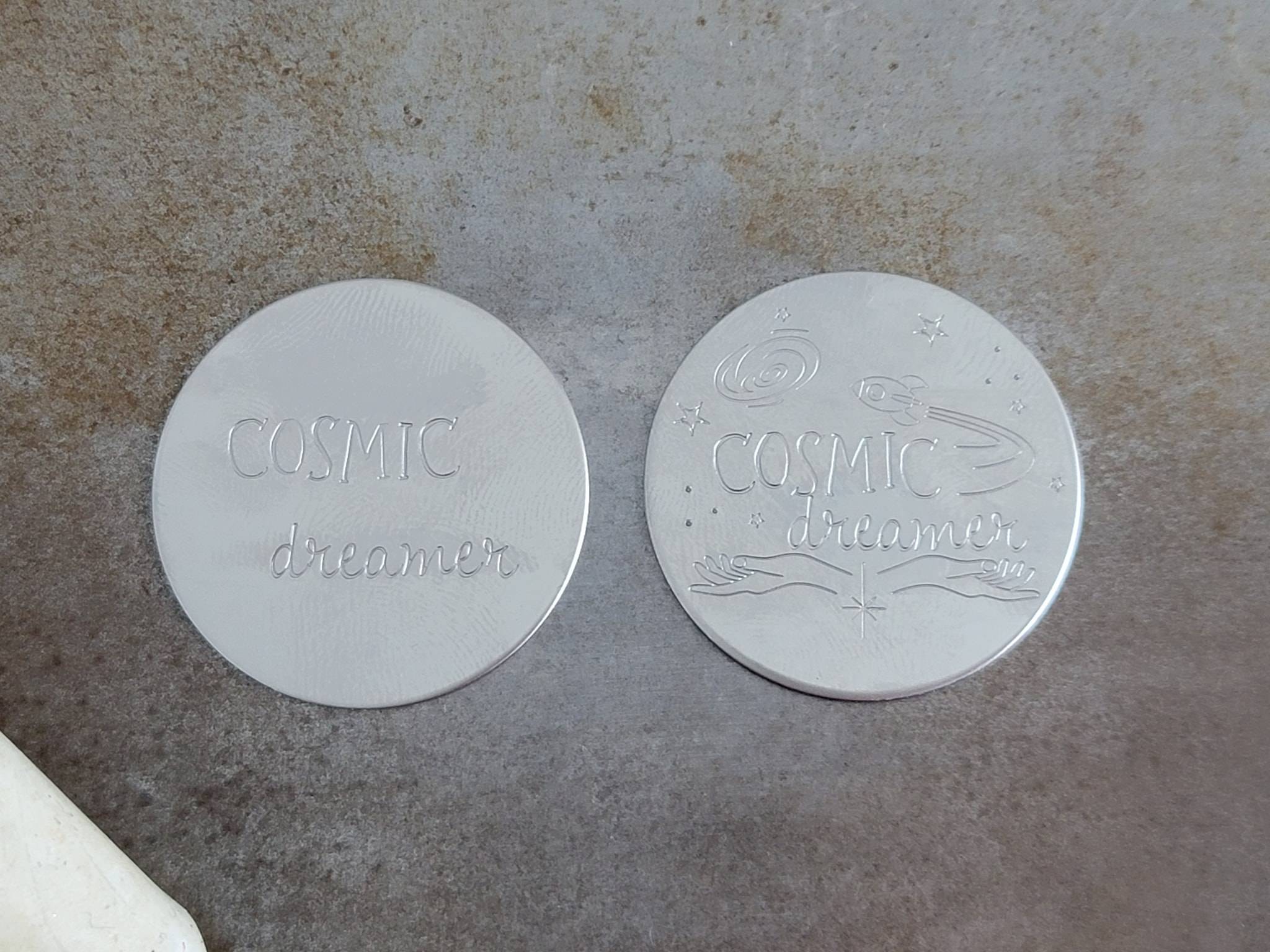
Another thing about spacing -- try stamping from the bottom of your blank and stamping toward the top! You'll get the spacing you had envisioned for the piece just by starting at the bottom! The COSMIC DREAMER on the left was stamped from top to bottom... and the COSMIC DREAMER on the right was stamped from bottom to top!
MIX & MATCH FONTS
An excellent way to stand apart is to mix and match your fonts. If you've been around our Facebook Group, Font Fixation's Fabulous Friends long enough, you may have heard me talk about the Four Types Of Fonts. If you break it down, there are really only Feminine, Masculine, Neutral, and Fun fonts, and all of our fonts fall somewhere on that spectrum. Sometimes a font, like Shadows Into Light, can fall into two categories; MASCULINE and NEUTRAL.
To mix and match fonts on your stamped works of art, take a font from one category, and a font from another category (not one that falls in BOTH categories) and combine those two fonts on one piece. Think of the EMPHASIS word, or the word you want to stand out apart from the normal hub-bub words like "and" & "the", and make that emphasis word your spectacular font that is usually bigger and bolder than the other words
Sometimes Mix & Match can be as easy as having the SAME FONT in multiple sizes! That creates the SAME dramatic effect that having multiple types of fonts will do for your stamped pieces!